The focus on the logo was to communicate the beautiful environment that surrounds Lincoln Street and the green space nearby including parks, recreation centers, and the Ice Age Trail that runs alongside the rear side of the building.

Rich Chocolate
#4b332f
Pecan
#e5cea4
Forest
#363f2d
Walnut
#967a3e
The focus on the color palette was to bring colors that were inspired by the surrounding environment and architecture of the building. The result, a rich palette that defines the Lincoln Street brand.

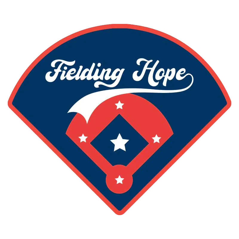
Fielding Hope is a non-profit organization that helps disabled veterans participate in a training camp with professional baseball players. We took elements from the baseball field, the American Flag, and a baseball inspired font to pull together a logo that truly encompass Fielding Hope’s vision.
It wasn’t hard to choose this color palette. We decided on “Red, White, and Blue”, which is representative of the American flag and the veteran’s who served.
Patriot Blue
#003463
White Stars
#ebebeb
Valor Red
#f13744

When designing Silver Lake’s logo the idea was to pull elements of the property itself and the surrounding area. Within that we focused on multiple oak leaves to represent multiple buildings and the vast population of mature oak tress on the property and in the surrounding area. The font chosen for this logo was to further enhance the beauty of the surrounding area.
Oxford Blue
#506372
Satin Nickel
#c8ccce
Oxford Blue
#3a4c56
Silver Lake’s color palette is focused on muted colors to represent a quiet and peaceful neighborhood. The blue slated hues were used to reinforce Silver Lake which is a couple blocks away from their location.

Lakeview Blue
#053e58
Platinum
#E7E7E7
Slate Black
#2f3530
When selecting the color palette, we decided upon a blue that hinted at the location on the Isthmus in between Lake Wingra and Lake Monona with complementary slated colors.
Uncover what makes your business special and connect with people who are looking for exactly what you offer.
Calls are screened. Please state your name to be connected.

Send a brief message and we’ll be in touch shortly.
